Energy & Carbon
The Energy & Carbon dashboard gives you a combined view of energy performance across all your managed sites. It is divided into KPI summary cards at the top and two resource tabs below.
KPIs
The dashboard tracks key indicators covering energy consumption, costs, renewable usage, carbon emissions, and efficiency ratings. Each KPI card shows the current value, a trend comparison against a previous period, and a link to drill into the data.
Energy Flow
The Energy Flow tab displays a Sankey diagram that visualizes how energy moves through your buildings.
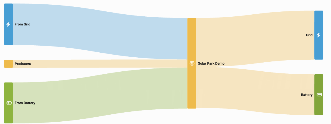
The diagram traces energy from source to destination:
- Sources — Grid imports, on-site producers (solar panels), battery exports
- Sites — Individual properties in your portfolio
- Distribution — Grid exports, battery charging
- Consumption — Technical systems, rental units, shared spaces, general consumption
You can filter by specific sites (up to four at a time) and adjust the date range. The flow values are displayed in MWh.
This view helps you understand where energy comes from, how it is distributed, and where it is consumed.
Optimizations
The Optimizations tab shows a timeline of automated energy optimization actions. These are adjustments made by the Fentrica AI platform and logic-based rules to reduce energy consumption — such as shifting setpoints, adjusting HVAC modes, or scheduling equipment operation around demand and pricing signals.
Each entry shows when the action was performed, which system was affected, what was changed, and whether it is scheduled or completed.